Advanced pop-ups and ArcGIS Dashboards
In this practical, we will continue working with the NOAA natural hazard data and the Web Map created in the previous sessions.
The practical has three parts:
- compare the main ArcGIS app-building options from no-code to high-code,
- improve the information design of the Web Map using HTML and Arcade pop-ups,
- create an interactive ArcGIS Dashboard in which maps, charts, indicators and selectors work together.
ArcGIS app-building options
ArcGIS offers several ways to turn maps and data into web applications. The appropriate tool depends on the purpose of the application, the required level of customisation and whether coding is needed.
The table is ordered approximately from no-code to high-code. Tools within the no-code group are not ranked; they are designed for different purposes.
| Tool | Coding level | Best suited for | Typical strengths | Main limitation |
|---|---|---|---|---|
| ArcGIS Instant Apps | No-code | Focused, purpose-driven map applications | Very fast deployment, predefined templates, simple configuration | Layout and functionality are largely defined by the selected template |
| ArcGIS StoryMaps | No-code | Narrative cartography and scrollytelling | Maps, text, media, map tours and immersive storytelling | Not intended as a general-purpose analytical application |
| ArcGIS Dashboards | No-code | Monitoring, overview and analytical summaries | Maps, indicators, charts, lists and selectors coordinated on one screen | Less flexible page layout than Experience Builder |
| ArcGIS Experience Builder | No-code → low-code | Flexible, responsive web applications | Custom layouts, pages, widgets, data sources, messages and actions | More configuration and design decisions are required |
| ArcGIS Maps SDK for JavaScript | High-code | Fully custom web mapping applications | Maximum control over maps, interface, interactions and application logic | Requires JavaScript development |
Builder or SDK?
Instant Apps, StoryMaps, Dashboards and Experience Builder are configurable app builders and can all be used without writing code.
ArcGIS Maps SDK for JavaScript is not a builder. It is a development SDK for creating custom web applications in JavaScript.
Experience Builder sits between both worlds: the standard builder is no-code, while Experience Builder Developer Edition can be extended with custom widgets, themes and actions.
Choosing the right tool
A useful first question is not Which builder is the most powerful?, but What should the user be able to do?
- communicate a spatial story → StoryMaps
- quickly expose one focused map workflow → Instant Apps
- monitor and compare indicators → Dashboards
- combine several maps, widgets and workflows in a custom interface → Experience Builder
- build functionality that the builders cannot provide → ArcGIS Maps SDK for JavaScript
Advanced pop-ups
A pop-up is part of the information design of a map, not merely a table of attributes. A well-designed pop-up should select, structure and format information so that the user can understand the selected feature quickly.
Compare a default attribute list with a configured pop-up:
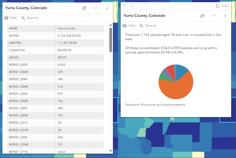
Example from Esri ArcGIS Blog: a default pop-up compared with a configured information display.
The general workflow follows the same logic as the Esri tutorial:
- configure fields,
- create a meaningful title,
- organise pop-up content,
- add charts or formatted text,
- use HTML for greater control over layout,
- use Arcade when information must be calculated, reformatted or displayed conditionally.
Resources
Configure fields
You already know how to enable pop-ups and display a field list. Before adding more advanced content, review the fields in each event layer and improve their presentation:
- hide fields that are unnecessary for the user,
- use readable display names / aliases,
- set appropriate number formatting,
- order the fields logically rather than following the source-table order.
For the NOAA datasets, for example:
- earthquake magnitude → 1 decimal place,
- tsunami maximum water height → 1 decimal place,
- VEI → 0 decimal places,
- deaths, missing persons and injuries → 0 decimal places with thousands separators where appropriate.
A chart needs numeric fields
Pop-up charts can only use numeric attributes. If a field such as Deaths, Missing or Injuries was imported as text, correct the data schema before using it in charts or analytical applications.
Create a meaningful pop-up title
The title should identify the feature immediately. It can combine static text and one or more fields.
For Tsunami Events, build a title from:
Location Name + Maximum Water Height + m
For example:
TOHOKU, JAPAN — 38.9 m
Use the Fields selector in the title editor rather than typing field tokens manually.
Think about missing values
A simple title works well when all required attributes are available. But what happens when Maximum Water Height (m) is empty?
Later we will use Arcade to display the height only when a value exists.
Organise pop-up content
A pop-up can contain several independent content elements. The most useful for our datasets are:
- Fields list – selected attributes in a structured table,
- Text – a combination of static text and field values,
- Chart – a graphical comparison of numeric fields,
- Arcade – dynamically generated content.
For Tsunami Events, add a bar chart called Human impact using:
DeathsMissingInjuries
These values are directly comparable because all three are counts of people.
Use charts selectively
A pop-up chart should compare values that are meaningful together. Avoid combining attributes only because they are numeric. For example, earthquake magnitude, number of deaths and financial damage use different units and should not be presented as one comparable scale.
HTML in pop-ups
The Text content element can use HTML to structure information more precisely than the default field list.
For example, create a compact summary table for Tsunami Events:
<table style="width:100%; border-collapse:collapse;">
  <tr>
    <td><strong>Year</strong></td>
    <td>{Year}</td>
  </tr>
  <tr>
    <td><strong>Country</strong></td>
    <td>{Country}</td>
  </tr>
  <tr>
    <td><strong>Deaths</strong></td>
    <td>{Deaths}</td>
  </tr>
  <tr>
    <td><strong>Missing</strong></td>
    <td>{Missing}</td>
  </tr>
  <tr>
    <td><strong>Injuries</strong></td>
    <td>{Injuries}</td>
  </tr>
</table>
To add attributes whose original names contain spaces or special characters, use the Fields tool in the editor. ArcGIS will insert the correct field token.
HTML is useful for:
- organising attributes into tables,
- adding visual hierarchy,
- emphasising important values,
- combining explanatory text and attributes,
- adding supported links and web content.
Do not overdesign the pop-up
HTML gives more control, but the goal is still information hierarchy and readability. A pop-up should remain compact and usable on smaller screens.
Arcade in pop-ups
Arcade is an expression language used across ArcGIS. In pop-ups it is especially useful when a value needs to be calculated, reformatted, interpreted or displayed conditionally without modifying the source data.
Arcade can be used in two main ways:
- Attribute expression – returns a single text or numeric value that can be used like another attribute.
- Arcade content element – returns an entire dynamically generated pop-up block.
Attribute expression vs. Arcade content
Attribute expression = calculate a value.
Arcade content = build part of the pop-up.
Simple text formatting
The NOAA data contain some country names in uppercase. An attribute expression can reformat them without modifying the source data:
For example:
Proper() is useful for ordinary names, but remember that abbreviations such as USA would become Usa.
Format an incomplete event date
The NOAA datasets store Year, Mo and Dy in separate fields, and month or day may be missing. Instead of displaying three separate values, create one human-readable date.
Open Pop-ups → Attribute expressions → Add expression and enter:
var y = $feature.Year;
var m = $feature.Mo;
var d = $feature.Dy;

if (IsEmpty(m)) {
    return Text(y);
}

if (IsEmpty(d)) {
    return Text(y) + "-" + Text(m, "00");
}

return Text(y) + "-" + Text(m, "00") + "-" + Text(d, "00");
Depending on the available attributes, the expression can return:
Give the expression a meaningful name such as:
The expression can then be inserted into a Text element like a normal field.
Improve the tsunami title
Improve the earlier tsunami title so that the water height is shown only when the value is available.
Use the exact field names suggested by the Arcade editor for your layer:
var place = $feature.Location_Name;
var height = $feature.Maximum_Water_Height_m;

if (IsEmpty(height)) {
    return place;
}

return place + " — " + Text(height, "0.0") + " m";
Field names in Arcade
The internal field names in your Hosted Feature Layer may differ from the display aliases shown in the map.
Use Profile variables → $feature or editor autocomplete to insert the correct field names instead of guessing them.
Arcade content element
An Arcade content element can generate a complete block of pop-up content. This is useful when the structure itself should change according to the available data.
For example, create a Human impact element that displays only casualty attributes for which NOAA contains a value:
var items = [];

if (!IsEmpty($feature.Deaths)) {
    Push(items, "<strong>Deaths:</strong> " + Text($feature.Deaths, "#,###"));
}

if (!IsEmpty($feature.Missing)) {
    Push(items, "<strong>Missing:</strong> " + Text($feature.Missing, "#,###"));
}

if (!IsEmpty($feature.Injuries)) {
    Push(items, "<strong>Injuries:</strong> " + Text($feature.Injuries, "#,###"));
}

var content = "";

if (Count(items) == 0) {
    content = "No casualty values are reported for this event in the database.";
} else {
    content = Concatenate(items, "<br>");
}

return {
    type: "text",
    text: "<div><strong>Human impact</strong><br>" + content + "</div>"
};
This differs from replacing missing values with zero. The expression preserves the distinction between:
- 0 – a reported value of zero,
- null / empty – no value is available in the database.
Pop-ups in applications
Pop-up configurations saved with a Web Map can be reused by ArcGIS applications such as Instant Apps, StoryMaps, Dashboards and Experience Builder.
The essential configuration usually persists, but individual applications may render content slightly differently. Always test the final pop-up in the application for which the Web Map is intended.
Pop-up task
Improve the pop-ups of the three NOAA event layers in your Web Map.
Your final map should demonstrate:
- meaningful titles,
- carefully selected and formatted fields,
- at least one pop-up chart,
- at least one HTML-formatted Text element,
- at least one Arcade attribute expression,
- at least one Arcade content element.
You do not need to configure all three layers identically. Choose the pop-up design according to the attributes and purpose of each dataset.
ArcGIS Dashboards
We will now use the same Web Map to create an interactive ArcGIS Dashboard. The aim is not to add as many elements as possible, but to build a coordinated interface in which the map, charts, indicators and selectors respond to each other.
Resources
Dashboard design
The dashboard will combine three perspectives:
- Human impact – aggregated deaths, missing persons and injuries,
- Map – spatial distribution and current map extent,
- Event intensity – magnitude, maximum tsunami water height and VEI.
A Year selector will filter the entire dashboard.
The interaction logic is:
- Year range → filters all three event types and analytical elements,
- Map extent → filters Human impact charts and event-count indicators,
- Intensity selection → filters the corresponding map layer, Human impact chart and indicator.
This allows several conditions to be combined.
Add the Web Map
Create a new ArcGIS Dashboard and add the Web Map prepared in the previous practical.
Arrange the main dashboard into three vertical areas:
- left panel – Human impact,
- centre – Map,
- right panel – Event intensity.
The map should occupy most of the available width.
Human impact charts
Create three Serial Chart elements, one for each event layer.
Earthquakes
Use:
- Data source: Web Map → Earthquake Events
- Categories: Fields
- Fields:
Deaths,Missing,Injuries - Statistic: Sum
- Title:
Earthquakes — Human impact
Tsunamis
Use:
- Data source: Web Map → Tsunami Events
- Categories: Fields
- Fields:
Deaths,Missing,Injuries - Statistic: Sum
- Title:
Tsunamis — Human impact
Volcanic eruptions
Use:
- Data source: Web Map → Volcano Events
- Categories: Fields
- Fields:
Deaths,Missing,Injuries - Statistic: Sum
- Title:
Volcanic eruptions — Human impact
Numeric fields are required
The Deaths, Missing and Injuries attributes must be numeric. If they were imported as text, they cannot be aggregated correctly in the chart.
Filter Human impact by the current map extent
Configure the Map element:
Map actions → Filter
Use the three Human impact charts as targets.
MAP EXTENT CHANGE
       │
       ├── Filter → Earthquakes — Human impact
       ├── Filter → Tsunamis — Human impact
       └── Filter → Volcanic eruptions — Human impact
When you zoom or pan the map, the three charts are recalculated using only events inside the current visible extent.
Categories from fields
The Human impact charts use Categories from fields. The bars represent several statistics calculated over the same set of features.
This chart type can be used as a target of a filter action, but it does not support selection-change events and therefore cannot act as the interactive source of our map filtering.
Event intensity charts
The right side of the dashboard will contain three charts that classify events by intensity.
These charts use Grouped values. Each bar or pie slice therefore represents a real group of features and can be used as a source of actions.
Prepare classification fields
For earthquake magnitude and tsunami water height, first create real classification fields in the source Hosted Feature Layers. A pop-up Attribute Expression is not sufficient because it is only part of the Web Map's pop-up configuration.
If your Web Map uses a Hosted Feature Layer View with a restricted field definition, make sure the newly created field is also exposed by the View.
Earthquake magnitude classes
Create a new text field:
Calculate it using Arcade:
var m = $feature.Mag;

if (IsEmpty(m)) return null;
if (m < 5) return "A — < 5.0";
if (m < 6) return "B — 5.0–5.9";
if (m < 7) return "C — 6.0–6.9";
if (m < 8) return "D — 7.0–7.9";

return "E — ≥ 8.0";
Tsunami water-height classes
Create another text field:
Calculate it using Arcade:
var h = $feature["Maximum Water Height (m)"];

if (IsEmpty(h)) return null;
if (h < 1) return "A — < 1 m";
if (h < 3) return "B — 1–2.9 m";
if (h < 10) return "C — 3–9.9 m";
if (h < 30) return "D — 10–29.9 m";

return "E — ≥ 30 m";
Why real fields?
A pop-up Attribute Expression behaves like a calculated value for presentation in the Web Map. It does not automatically become a field that Dashboard can use for Grouped values.
For this exercise, storing the classes in real fields keeps the Dashboard configuration transparent and reusable.
Earthquakes by magnitude
Create a Serial Chart:
- Data source: Web Map → Earthquake Events
- Categories: Grouped values
- Category field:
Magnitude_Class - Statistic: Count
- Title:
Earthquakes by magnitude
Set:
The categories should appear as:
Tsunamis by maximum water height
Create another Serial Chart:
- Data source: Web Map → Tsunami Events
- Categories: Grouped values
- Category field:
Wave_Class - Statistic: Count
- Title:
Tsunamis by maximum water height
Set:
Why use A–E prefixes?
Dashboard can sort grouped categories by the category field itself. Prefixing labels with A–E gives the classes a stable logical order when Sort by → class field → Ascending is used.
Sorting by Count would instead order the classes by frequency.
Volcanic eruptions by VEI
Use a Pie Chart for the third intensity view. This demonstrates that the same interaction logic is not limited to bar charts.
Configure:
- Data source: Web Map → Volcano Events
- Categories: Grouped values
- Category field:
VEI - Statistic: Count
- Title:
Eruptions by VEI
Use the chart to show the composition of recorded eruptions by VEI category.
Bar chart or pie chart?
A bar chart is generally better for precise comparison of category frequencies.
Here we deliberately use a pie chart to demonstrate a second interactive chart type and to emphasise the relative composition of the eruption dataset.
Use intensity charts to control the dashboard
For each right-side intensity chart, configure Filter actions.
Each chart should filter:
- its corresponding event layer in the map,
- its corresponding Human impact chart,
- its corresponding event-count Indicator.
For example:
Earthquakes by magnitude
          │
          ├── Filter → Earthquake Events in the map
          ├── Filter → Earthquakes — Human impact
          └── Filter → Earthquake Events indicator
Apply the same logic to Wave_Class and VEI.
The Human impact chart therefore combines two conditions:
For example:
Zoom to Japan → select
E — ≥ 8.0→ inspect the deaths, missing persons and injuries for earthquakes of magnitude 8 or greater inside the current extent.
Coordinated multiple views
The map and charts are not independent visualisations. A user action in one element changes the data displayed in other elements.
This principle is often described as coordinated multiple views: the same data are explored through spatial, categorical and quantitative representations that remain linked.
Event-count indicators
Add three Indicator elements above the map:
Earthquake EventsTsunami EventsVolcano Events
For each Indicator:
- use the corresponding event layer as the data source,
- calculate Count,
- use a clear title and a large numeric value.
Extend the Map extent action so that the indicators are also filtered by the current visible extent:
Also target the corresponding Indicator from each intensity chart.
For example, selecting Wave_Class = D should update:
- the Tsunami Events layer in the map,
Tsunamis — Human impact,- the Tsunami Events Indicator.
Filter the dashboard by year
The NOAA datasets contain a numeric Year field, while month and day may be missing. We will therefore use a Number selector rather than a Date selector.
Add the Number selector
Selectors are not added as ordinary dashboard elements.
- Add a Header or Sidebar to the desktop view.
- On the action bar, click View.
- In the View pane, open Header or Sidebar.
- Click Add selector.
- Choose Number selector.
Configure the selector, for example:
- Label:
Year - Presentation mode:
DropdownorInline - Display type:
SliderorCombination - Input type:
Range - Limits from:
Defined values - Minimum:
1900 - Maximum:
2026 - Increment:
1 - Precision:
0
The selector itself is a generic numeric control. It is not linked to the Year attribute on the Selector tab.
Connect the selector to the data
Open:
Number selector → Actions → Filter
For every target, map the selector values to the appropriate numeric Year field.
Configure the selector to filter:
- Earthquake Events map layer →
Year - Tsunami Events map layer →
Year - Volcano Events map layer →
Year - all three Human impact charts,
- all three intensity charts,
- all three event-count indicators.
Selector value vs. target field
The Number selector only produces a number or numeric range.
The connection to a real attribute is defined later in Actions, where each target is linked to its Year field.
One selector can therefore apply the same numeric range to several independent layers.
The final Dashboard combines three analytical dimensions:
YEAR RANGE
    │
    ↓
all event types and dashboard elements

MAP EXTENT
    │
    ↓
Human impact + event counts

INTENSITY CLASS
    │
    ├── corresponding map layer
    ├── Human impact
    └── event count
For example:
2000–2026 → zoom to Japan → select earthquakes
E — ≥ 8.0
The map, Indicator and Human impact chart will update according to the combined filters.
Dashboard task
Create a coordinated Dashboard using the NOAA event layers.
Your final Dashboard should contain:
- the Web Map,
- three Human impact Serial Charts,
- two intensity Serial Charts,
- one VEI Pie Chart,
- three event-count Indicators,
- a Year range Number selector,
- Map extent actions that dynamically update analytical elements,
- intensity-chart actions that filter the corresponding map layer, Human impact chart and Indicator.
Test several combinations of time, map extent and event intensity and verify that the dashboard elements respond consistently.
What have we built?
The workflow in this practical progresses from information design to interactive analytical design:
Web Map
   │
   ├── Pop-ups
   │     ├── field formatting
   │     ├── HTML
   │     └── Arcade
   │
   └── ArcGIS Dashboard
         ├── Map
         ├── Charts
         ├── Indicators
         ├── Selector
         └── Actions
The important principle is that a web mapping application is not only a collection of visual elements. The elements should be selected and connected according to the questions the user needs to answer.